SegmentedControl
SegmentedControl element represents a single-select toggle group. It is similar to Radio element. They differ in appearance: SegmentedControl renders as a row of connected toggle buttons instead of a list of radio inputs.
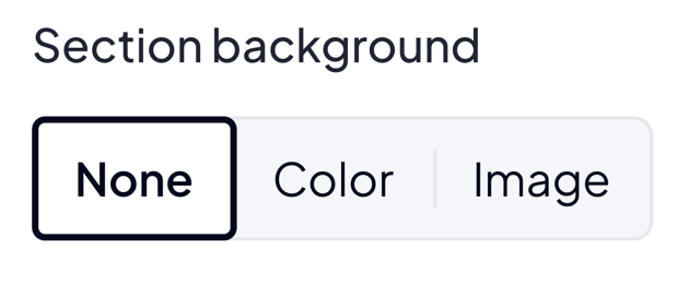
Use SegmentedControl when the option list is short (typically 2 to 4) and you want a compact, button-style picker. For longer lists or per-option descriptions use Radio or Select instead.
Options
radioOptions
array List with options. Every object on the list must have label and key.
radioOptions.key
string Represents value in option.
radioOptions.label
string Represents text inside the toggle button.
JSON - options
{
  "options": {
    "radioOptions" : [
      { "key" : "KEY 1", "label" : "Label 1" },
      { "key" : "KEY 2", "label" : "Label 2" },
      { "key" : "KEY 3", "label" : "Label 3" }
    ]
  }
}
Build-in Validators
Element validates if given value is located on your radioOptions list.
Available Validators
Element does not have available validators.
Relations Support
Element supports relations between elements.
Configuration output schema
schema
{
  "<element_type>" : "segmentedControl",
  "<element_name>" : string,
  "<element_label>" : string,
  "<element_labelDescription>" : string,
  "<element_isRequired>" : bool,
  "<element_isHidden>" : bool,
  "<element_defaultValue>" : string,
  "<element_options>" : {
    "<element_option_radioOptions>" : [
      {
        "<radioOptions_key>" : string,
        "<radioOptions_label>" : string,
      },
      {
        "<radioOptions_key>" : string,
        "<radioOptions_label>" : string,
      }
    ]
  }
}
example
{
  "type" : "segmentedControl",
  "name" : "alignment",
  "label" : "Text alignment",
  "defaultValue" : "left",
  "options": {
    "radioOptions" : [
      { "key" : "left",   "label" : "Left" },
      { "key" : "center", "label" : "Center" },
      { "key" : "right",  "label" : "Right" }
    ]
  }
}
Element value
If value is filled: string.
usage in module TWIG
{% if moduleConfig.alignment %}
    <div class="align_{{ moduleConfig.alignment }}">
        ...
    </div>
{% endif %}
Example of module
Twig
JSON configuration
JSON configuration
[
  {
    "label": "Heading",
    "state": "unfolded",
    "elements": [
      {
        "name": "alignment",
        "type": "segmentedControl",
        "label": "Text alignment",
        "defaultValue": "left",
        "options": {
          "radioOptions": [
            { "key": "left",   "label": "Left" },
            { "key": "center", "label": "Center" },
            { "key": "right",  "label": "Right" }
          ]
        }
      }
    ]
  }
]
JSON translations
JSON translations
{
  "module": {
    "pl_PL": {
      "left": "Lewo",
      "center": "Środek",
      "right": "Prawo"
    },
    "en_US": {
      "left": "Left",
      "center": "Center",
      "right": "Right"
    }
  },
  "schema": {
    "pl_PL": {
      "Heading": "Nagłówek",
      "Text alignment": "Wyrównanie tekstu",
      "Left": "Lewo",
      "Center": "Środek",
      "Right": "Prawo"
    },
    "en_US": {
      "Heading": "Heading",
      "Text alignment": "Text alignment",
      "Left": "Left",
      "Center": "Center",
      "Right": "Right"
    }
  }
}