PointPicker
PointPicker element allows users to select a point position on a 2D plane. It is designed for use cases like positioning hotspots on images or other module areas. The value is stored as an object with x, y coordinates (0-100) and a unit field.
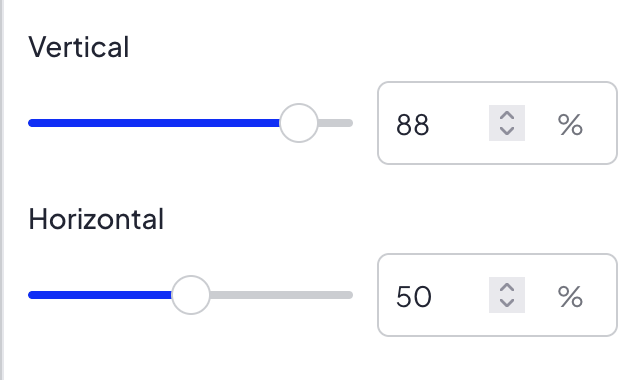
In New SVE, PointPicker supports two ways of setting the value:
- using two sliders for vertical and horizontal position,
- using the Pick on preview button to select a point directly on the edited module in preview.
Options
PointPicker does not have any options.
Built-in Validators
Element has a built-in validator that checks:
x— must be an integer between 0 and 100y— must be an integer between 0 and 100unit— must be%
No extra keys are allowed. All three keys (x, y, unit) are required.
Available Validators
Element does not have any available validators.
Relations Support
Element does not support relations between elements.
Configuration output schema
{
  "<element_type>" : "pointPicker",
  "<element_name>" : string,
  "<element_label>" : string,
  "<element_labelDescription>" : string,
  "<element_isRequired>" : bool,
  "<element_isHidden>" : bool,
  "<element_defaultValue>" : {
    "x" : int,
    "y" : int,
    "unit" : "%"
  }
}
{
  "type" : "pointPicker",
  "name" : "hotspotPosition",
  "label" : "Hotspot position",
  "labelDescription" : "Select the position of the hotspot on the image",
  "isRequired" : true,
  "isHidden" : false,
  "defaultValue" : {
    "x" : 50,
    "y" : 50,
    "unit" : "%"
  }
}
Element value
Element value is an object with 3 keys:
| Name | Type | Description |
|---|---|---|
| x | int | Horizontal position (0-100) |
| y | int | Vertical position (0-100) |
| unit | string | Unit of the position, always % |
Frontend behavior
In New SVE frontend, values from sliders are rounded with Math.round on each change before saving to form state. This ensures x and y are always stored as integers.
PointPicker also displays the Pick on preview button. After clicking it, New SVE enters point selection mode:
- the edited module is highlighted in preview,
- the area outside the edited module is covered with a semi-transparent blurred overlay,
- clicking inside the edited module sets new x and y values,
- the button stays in active state until the point is selected or the selection mode is cancelled,
- pressing ESC or clicking outside the edited module cancels the selection mode.
The point selected on preview is calculated relative to the whole edited module area. The top-left corner of the module is x: 0, y: 0, and the bottom-right corner is x: 100, y: 100.
<div style="left: {{ moduleConfig.hotspotPosition.x }}{{ moduleConfig.hotspotPosition.unit }}; top: {{ moduleConfig.hotspotPosition.y }}{{ moduleConfig.hotspotPosition.unit }};">
    ...
</div>
Example of module
Twig
<div class="hotspot-container" style="position: relative;">
    <img src="{{ moduleConfig.image.paths.original }}" alt="">
    <div class="hotspot-pin" style="position: absolute; left: {{ moduleConfig.hotspotPosition.x }}{{ moduleConfig.hotspotPosition.unit }}; top: {{ moduleConfig.hotspotPosition.y }}{{ moduleConfig.hotspotPosition.unit }};">
        {{ translate("Pin") }}
    </div>
</div>
JSON configuration
[
  {
    "label": "General settings",
    "state": "unfolded",
    "elements": [
      {
        "name": "image",
        "type": "imageUpload",
        "label": "Image",
        "isRequired": true
      },
      {
        "name": "hotspotPosition",
        "type": "pointPicker",
        "label": "Hotspot position",
        "labelDescription": "Select the position of the hotspot on the image",
        "isRequired": true,
        "defaultValue": {
          "x": 50,
          "y": 50,
          "unit": "%"
        }
      }
    ]
  }
]