Header
Header element can be used as a header for section. Work perfectly with children field.
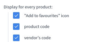
In the picture below, it is the "Display for every product:" phrase:
Options
icon
string Optional parameter. You can set an icon next to your Header label.
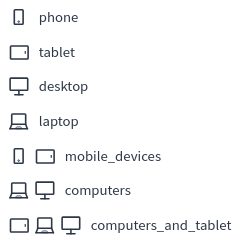
Available icons:
Build-in Validators
Element has no build-in validators.
Available Validators
Element does not have available validators.
Relations Support
Element does not supports relations between elements.
Configuration output schema
schema
{
  "<element_type>" : "header",
  "<element_name>" : string,
  "<element_label>" : string,
  "<element_labelDescription>" : string,
  "<element_hint>" : string,
  "<element_isHidden>" : bool,
  "<element_options>" : {
    "<element_icon>" : string
  },
  "<element_children>" : []
}
example
{
  "type" : "header",
  "name" : "header",
  "label" : "Mobile devices",
  "labelDescription" : "Configuration for mobile devices.",
  "hint": "Decide if you want to display arrows on mobile devices.",
  "isHidden" : false,
  "options": {
    "icon" : "mobile_devices"
  },
  "children": [
    {
      "type": "checkbox",
      "name": "navigation",
      "label": "Enable navigation arrows",
      "defaultValue": 1
    }
  ]
}
Element value
Header does not produce a value of its own — it is only used to visually group its children elements under a label (optionally with an icon) inside the configurator. The values of its children elements appear directly in moduleConfig, exactly as if they were not nested inside the header.
Example of module
Twig
Twig
{% if moduleConfig.navigation %}
<button class="slider__arrow slider__arrow_prev"><</button>
<button class="slider__arrow slider__arrow_next">></button>
{% endif %}
JSON configuration
JSON configuration
[
  {
    "label": "Mobile devices",
    "state": "unfolded",
    "elements": [
      {
        "type": "header",
        "name": "header",
        "label": "Mobile devices",
        "labelDescription": "Configuration for mobile devices.",
        "hint": "Decide if you want to display arrows on mobile devices.",
        "options": {
          "icon": "mobile_devices"
        },
        "children": [
          {
            "type": "checkbox",
            "name": "navigation",
            "label": "Enable navigation arrows",
            "defaultValue": 1
          }
        ]
      }
    ]
  }
]
JSON translations
JSON translations
{
  "schema": {
    "pl_PL": {
      "Mobile devices": "Urządzenia mobilne",
      "Configuration for mobile devices.": "Konfiguracja dla urządzeń mobilnych.",
      "Decide if you want to display arrows on mobile devices.": "Zdecyduj, czy chcesz wyświetlać strzałki na urządzeniach mobilnych.",
      "Enable navigation arrows": "Włącz strzałki nawigacji"
    },
    "en_US": {
      "Mobile devices": "Mobile devices",
      "Configuration for mobile devices.": "Configuration for mobile devices.",
      "Decide if you want to display arrows on mobile devices.": "Decide if you want to display arrows on mobile devices.",
      "Enable navigation arrows": "Enable navigation arrows"
    }
  }
}