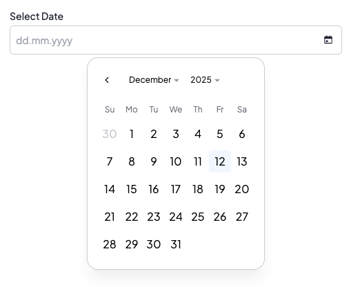
DatePicker
DatePicker element is an input for selecting a date. It allows users to pick a single date or a single date + time using a calendar picker interface or by typing directly. Users can type dates using the dd.mm.yyyy format (e.g., 15.03.2026) with real-time validation for days (01-31), months (01-12), and years (19xx, 20xx). The input includes automatic formatting, validation against disabled dates, and keyboard navigation using Tab to move between day → month → year sections. Users can clear the value by deleting any part of the date.
DatePicker
DatePicker with time - date
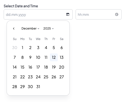
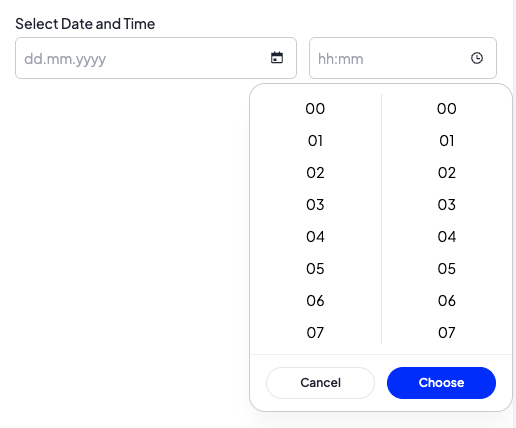
DatePicker with time - time
Options
withTime
bool Optional parameter. If set to true, the element allows selecting both date and time. When enabled, the element uses a date-time picker instead of a date-only picker. Default value is false.
Build-in Validators
Element validates if given value is a date in format YYYY-MM-DD when withTime is false, or YYYY-MM-DD HH:MM:SS when withTime is true.
Available Validators
Element does not have any available validators.
Relations Support
Element does not support relations between elements.
Configuration output schema
{
  "<element_type>" : "datePicker",
  "<element_name>" : string,
  "<element_label>" : string,
  "<element_labelDescription>" : string,
  "<element_isRequired>" : bool,
  "<element_isHidden>" : bool,
  "<element_defaultValue>" : string,
  "<element_options>" : {
    "<element_option_withTime>" : bool
  }
}
{
  "type" : "datePicker",
  "name" : "date",
  "label" : "Pick date",
  "labelDescription" : "Select a date for the event",
  "isRequired" : true,
  "isHidden" : false,
  "defaultValue" : "2025-12-08",
  "options": {
    "withTime" : false
  }
}
{
  "type" : "datePicker",
  "name" : "dateTime",
  "label" : "Event date and time",
  "labelDescription" : "Select date and time for the event",
  "isRequired" : true,
  "defaultValue" : "2025-12-08 14:30:00",
  "options": {
    "withTime" : true
  }
}
Element value
Element has different value format depending on location in the system
The format of this element's value differs depending on where it is used in the system.
In SVE "defaultValue" and "value" format depends on configuration:
- When withTime is false: YYYY-MM-DD
- When withTime is true: YYYY-MM-DD HH:MM:SS
In Twig, the value is returned as DateTime object, which can be formatted as needed.
<div>
  <b>datetime</b><p>{{ moduleConfig.dateTime.getTime() }}</p></br>
</div>
Example of module
DatePicker (date only)
Twig
[
  {
    "label": "EXAMPLE",
    "state": "unfolded",
    "elements": [
      {
        "name": "date",
        "type": "datePicker",
        "hint": "Select date for the event",
        "label": "Event date",
        "labelDescription": "Select date for the event",
        "isRequired": true,
        "defaultValue": "2025-12-08"
      }
    ]
  }
]
DatePicker with time
Twig
[
  {
    "label": "EXAMPLE",
    "state": "unfolded",
    "elements": [
      {
        "name": "dateTime",
        "type": "datePicker",
        "hint": "Select date and time for the event",
        "options": {
          "withTime": true
        },
        "label": "Event date and time",
        "labelDescription": "Select date and time for the event",
        "isRequired": true,
        "defaultValue": "2025-12-08 14:30:00"
      }
    ]
  }
]