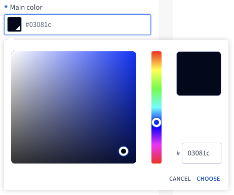
ColorPicker
ColorPicker element is an input with color type.
Options
allowVariables
bool Optional parameter. If it's set to true then user can choose color from predefined variables. Default value is false.
Available variables are: - @primaryColor, @primaryColors10, @primaryColors20, @primaryColors50, @primaryColors100, @primaryColors200, @primaryColors300, @primaryColors400, @primaryColors500, @primaryColors600, @primaryColors700, @primaryColors800, @primaryColors900 - @secondaryColor, @secondaryColors10, @secondaryColors20, @secondaryColors50, @secondaryColors100, @secondaryColors200, @secondaryColors300, @secondaryColors400, @secondaryColors500, @secondaryColors600, @secondaryColors700, @secondaryColors800, @secondaryColors900 - @neutralColor, @neutralColors0, @neutralColors10, @neutralColors20, @neutralColors50, @neutralColors100, @neutralColors200, @neutralColors300, @neutralColors400, @neutralColors500, @neutralColors600, @neutralColors700, @neutralColors800, @neutralColors900, @neutralColors1000 - @globalBodyBackgroundColor - @globalFontColor
allowGradient
bool Optional parameter. If it's set to true then user can choose gradient color. Default value is false.
Build-in Validators
Element validates if chosen color is correct. Colors in Hex are allowed If allowVariables in options is set to true then it will be checked if variable is from available variables list (below) or is it hex.
Available Validators
Element does not have available validators.
Relations Support
Element supports relations between elements.
Configuration output schema
{
  "<element_type>" : "colorPicker",
  "<element_name>" : string,
  "<element_label>" : string,
  "<element_labelDescription>" : string,
  "<element_isRequired>" : bool,
  "<element_isHidden>" : bool,
  "<element_defaultValue>" : string,
  "<element_options>" : {
    "<element_allow_variables>" : bool,
  }
}
{
  "type" : "colorPicker",
  "name" : "color",
  "label" : "Pick color",
  "labelDescription" : "Title of module will be presented in this color.",
  "isRequired" : true,
  "isHidden" : false,
  "defaultValue": "#fff",
  "options": {
    "allowVariables": true
  }
}
Element value
Element has different value format depending on location in the system
The format of this element's value differs depending on where it is used in the system and given value.
In SVE "defaultValue" and "value" is hex #FFFFFF, #FFFFFFAA.
When color is with alpha then in twig and css it is converted from #7F11E0AA to rgba(127, 17, 224, 0.67).
When color is defined by variables like @primaryColor then in twig it is converted from @primaryColor to var(--primaryColor).
{
  "type" : "colorPicker",
  "name" : "color",
  "label" : "Pick color",
  "labelDescription" : "Title of module will be presented in this color.",
  "isRequired" : true,
  "isHidden" : false,
  "defaultValue": "@primaryColor",
  "options": {
    "allowVariables": true
  }
}
When we want to define a gradient, then in twig value will be converted to.
Allowed gradient types are: linear-gradient and radial-gradient.
Property angle is needed for radial-gradient and value should be between 0-360 degrees.
Property radialShape is needed for linear-gradient and value should be circle.
{
  "type" : "colorPicker",
  "name" : "color",
  "label" : "Pick color",
  "labelDescription" : "Title of module will be presented in this color.",
  "isRequired" : true,
  "isHidden" : false,
  "defaultValue": {
    "gradientType": "radial-gradient",
    "radialShape": "circle",
    "colors": [
      {
        "stop": 20,
        "value": "#FFA"
      },
      {
        "stop": 60,
        "value": "#FFAAAA"
      },
      {
        "stop": 80,
        "value": "#AAAAAAFF"
      }
    ]
  },
  "options": {
    "allowGradient": true
  }
}
<p style="background:radial-gradient(circle, rgba(255, 255, 170, 0.13) 20%, rgba(255, 170, 170, 1) 60%, rgba(170, 170, 170, 1) 80%);">Some text here</p>
{
  "type" : "colorPicker",
  "name" : "color",
  "label" : "Pick color",
  "labelDescription" : "Title of module will be presented in this color.",
  "isRequired" : true,
  "isHidden" : false,
  "defaultValue": {
    "gradientType": "linear-gradient",
    "angle": 90,
    "colors": [
      {
        "stop": 20,
        "value": "#FFA"
      },
      {
        "stop": 60,
        "value": "#FFAAAA"
      },
      {
        "stop": 80,
        "value": "#AAAAAAFF"
      }
    ]
  },
  "options": {
    "allowGradient": true
  }
}